To celebrate the launch of my new website I am happy to include you in my final decisions!
Help me choose PolyPediaOnline Express LOGO!
One of you commenting/replying to this post will win a 50$ gift card in my new Express store!
~~~~~~~~~~~~~~~~~~~~~~~~~~~~~~~~
HOW TO CHOOSE A NEW LOGO FOR POLYPEDIAONLINE EXPRESS –
THANK YOU! VOTING IS NOW CLOSED!
WINNER ANNOUNCED IN THIS POST
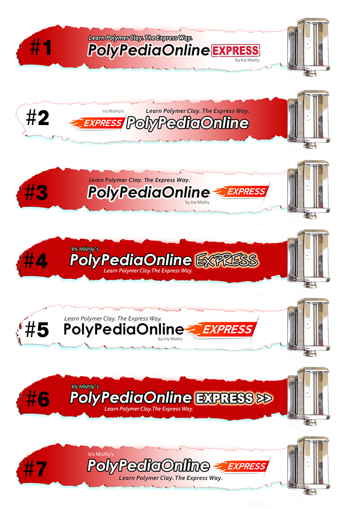
1. Choose your favourite logo and write its number in the comments section below (psssstt… you can peek and see what others wrote…)
2. Write your e-mail in your response, I want to send the prize to you!
3. If you want to share this blog post with your Facebook friends and Twitter followers you will double your chances!
Press on the relevant icon on the bottom of this post to share, or “copy & paste” the post link (don’t forget to let us know if your comment where you shared it).
4. If you place an order in the new site, you will triple your chances!
Your name will be entered 3 times into the raffle.
The winner will be announced here, in the Express Blog.
Make sure you come back on May 31st 2014 to find out if you won!
That’s it! You’re done!
P.S. – Don’t miss the special 20%OFF coupon code for extra 20% discount on all tutorials!
Valid until June 7th!
Enter the code -20%OFF- on checkout and the amount will be automatically reduced from your cart.
See you in several days with more Express celebration and new Express FREEbies videos!
THANK YOU!
Iris.
212 comments
Trackbacks and pingbacks
-
Express Winner and 2 New Free Polymer Clay Video Tutorials | PolyPediaOnlineExpress.comPolyPediaOnlineExpress.com
[…] an amazing response to the PolyPediaOnline Express new logo voting! 208 comments posted! So many votes & […]




iris, i liked them all! but number 3 is my favorite :) good luck with your website!
❤️ #1! #1= FABULOUS! Congrats on your new website !
I did this once already, but you are requesting it again. I vote for #7
I think number 6 is the most readable. It seems more legible.
Hi lris – l think no. 7 is the best :-) Off to browse the new website!
I agree. #7 is the one I like.
I liked the previous pag, it is now easier to use I vote for the logo 2.
enhora good for such wonderful work
bes
Number 2 for me. It is easy to read, clear and concise. Says it all simply!
Hi Iris!
Best of luck with the new site! I admire your work! My favorite logo is number 3! I shared this on Facebook
I really like #3. I love the Skinner blend and it really pops!
#1 is my favorite, for the way in which the word “express” in written :)
Thank you Iris and fantastic idea for this new website , number 3 is my favorite too.
Think they’re all great but like #7 best. Good luck with the new site.
#3 speaks to me the most. It seems to be the clearest in the look of it and how the info is presented. Have fun picking!
Hi,iris
I like number 7. Wish you good luck with your new express website.
mihaela
I like them all, but I think #7 is the easiest to read.
I like #6 the best, it is the cleanest, strongest design. I like some of the elements on the others, like the skinner blend, but some of them have too many elements competing with each other.
Best wishes for your new website. It was a toss-up between #3 and #7, but I think the black font in #3 stands out better. That would be my favorite.
They are all cool, but my favorite is #1
I really like #7 the best it is clear and precise and has your name on it!
Hi gal,
My favorite is #7. I love the the way the wording is laid out and ease of reading.
Hugs
I like them all but No. 2 is my favorite. The bright white leads into the name . I shut my eyes and opened them and my eyes were immediately focused on no. 2.
Hi Iris, # 3 is easily my pick! Great contrast, clear font and a nice example of Skinner blend for anyone who knows anything about polymer clay .As always, I am impressed by your dedication to customers.
I prefer #7. Easier to read, the font is timeless, and the message is below the main title, which is how our eyes naturally follow a written page.
I think #3 is the most attractive and clearest to read although I like them all!
#4 is a clear winner for me.
Iris. I like 3. They are all fabulous! Kathy Weaver
It was between numbers 3 and 7 for me…. they are quite similar. Number six made my eyes hurt, as it was just too red (which I find too aggressive a colour)… but I think overall I would go for number THREE, because I like how the words PolyPediaOnline blend as well into the white clay, rather than being laid on top with harder outlines. Good luck with your new website!
All nice, but for me #3 is the most readable with good design elements incorporated.
#3’s my favorite. Thanks for the updated and much easier website.
I like number 6!
Number 2 is doing it for me and loving the new website x
# 7 that one pops out to me and was the one that I fully read :)
My favorite logo is #1
I like #7 best. The red to white Skinner blend is clear. I like the flames on Express.
Congrats on the new website! I think this is a great change. I prefer #3. I like the way the outline letters blend into the white. I like the Skinner Blend look as it reads more dynamic than the flat color and also hints at the techniques you can learn, and I like the tag line at the top of the name. Best wishes to you, Miss Iris! Enjoy the day! Erin
I like #3, the red drew my eye and then it was easy and clear to read to the right. Nice site.
Iris, love the new look and feel of the site. I think logo #5 goes best with your clean new look.
I like #6. Looking forward to the next tutorial.
I like number 5
I think #1 is the clearest and stands out the most, definitely my choice!
My favourite is #3. Love the look of your new website Iris. I hope your sales continue to grow and look forward to new tutorials.
Lynne x
I really like #3, Iris! Easy to read, like the Skinner blend, too!
I love #4 because of the way express is written. It reminds of a locomotive (express).
I like more nº 4
#6 hobbyaholic@gmail.com
Number 7 , easy to read and gives the most information. Good Luck. And I just bought one of your all in one tutorials, ON SALE FOR A GREAT PRICE.
Thank you so much Linda! :)
#7 would be the one I pick. Your name on top is important because it is your site and lets people know who the site owner is. The skinner blend form left to right draws the eye along for those of us who read left to right. The flames on the word express imply the speed you want to provide your user. Best of luck with your new site. I learned so much from you when first starting with polymer clay and look forward to improving with you help. -Liz
I’m with Sunny Rush – #7 is the most natural “read.” Nice job on all of them, though!
#7, though 3 was the runner-up. I’m eager to see the changes. Good luck!
I like #2 the best. I like the white beginning and the transition to Red. It is easy to read, and your eye (those who read left to right, anyway) can see right away what it is without having to actually READ the whole name. I like the “skinner blend” subtle touch too, versus a solid color banner.
My very favorite is number 6 !
Number #3 has my vote. Wishing you much success with your new website! :)
I like number 2 the best it just jumps out good luck with the new site x
#3.
I like #7.
I think #7 is the best Love the pasta machine and skinner blend .Easy to read .Best of luck with the new website look forward to browsing, have lots of your tutorials already .
I choose #5. I have macular degeneration which makes it difficult to read certain text and I can easily read everything on #5.
#5 clean clear concise and easiest on the eye
I like #4.
The winner is…#7! Your name is prominent, without being dominating, In some of the samples it was hard to see. The skinner blend goes from dark to light. My runner up was #2, which is the opposite. Good job on all the choices, though.And KUDOS for the new webisite! So easy to navigate. It seems so welcoming. Good luck!
Dear Iris, am so excited about your new website and how you have designed it!
Now I am not a big fan of Red backgrounds or dark backgrounds on a website.
They are more difficult to read and harder on the eyes trying to pick out the text.
A little color change is nice and that’s why I liked No. 1 the best where it runs from
a bright red to white with an emphasis on the boxed express text which I feel is
more suited and looks more professional than the “flames”. I really think you nailed
it with the No. 1 Header. Thanks so much for letting us vote!
I like number 7 .
Love the new look! Good luck with the new website. I like number 3 the most and number 7 in second place. Neshikot!
I like number 3 best.
#4 seems to pop out to me.
#7, although I liked #3 as well
Congrats on the new site! I vote #7!
I like #4 because because of the way the word Express looks.
I wote for number 2. It is crisp and clear. Easy to read.
Love the look of number 5. Clean, clear and concise. Congrats on the new look.
I like number 6.
Hello Iris, my favorite is #7 because your name is on top and is the first thing you see. Congratulations for the changes they are great. Best regards, MaríaEva Ramos -Venezuela.
e-mail: ninastudio.caracas@gmail.com
I like #1. Good Luck with your new site!
I vote for #7. It catches the eye quickly and I like the idea of a Skinner blend. Your name above the site name says who owns the site and is not an after thought as it would be below the site name
I like #3 the best.
Number 3 is my fave. Great use of colour and skinner blend. Easy to read and highlights express well.
My choice is #4 for the following reasons:
1.The solid red background makes the main part of the logo really POP.
2.With the solid red background, the smaller print doesn’t fade into the gradient like #1, #3 & #7.
3.Your name is on it so that newbies will know this is YOUR site.
4.The word Express is in a fun font highlighted by a background of light yellow, which is a nice changeup from the other blocky fonts and makes it stand out.
Love #3 and the new website is brilliant.
Dear Iris, I vote for # 4. It is visually simple and clear
1. The word “express” says it all. No need to reinforce the message visually by susing flames which belong more to a racing car business.
2. the skinner blend effect is interesting but making it more visually difficult to read or distracting the eye.
3. The font used for “Express” is just perfect. It looks like it has been handwritten and indirectly refers to handcrafting
4. It draws the eye to the essential which is: your name, the name of your web site and the idea that is is easy to find what you’re looking for.
All the best, Pascale
I like #2
I like 7 the best.
Hallo Iris,
I like number three!
For me #6 is the best! :)
#6, in my opinion, is the cleanest, most professional looking logo. It presents the website’s information logically and clearly.
I like #3 the best. I like the Skinner blend and the way the Website name flows into the white part of the Skinner blend. The only thing I would change is the “Express” to the way it is done in #1 as the red color goes better with the blend. I like the smaller printing better in #3 than #1 – easier on my eyes!
Good luck with your new website. I’ll be visiting in often!
I like # 3 the best, however I’d use the word “EXPRESS’ from # 4. It has a bit more character.
Good luck Iris! I vote for #7
I like # 2 the best. It starts out easy on the eyes without being too loud in color at the end. It’s easy to read also. This is fun to see everyone’s thoughts.
I vote for #3. It is the easiest to read.
I love #4!!! Great job!
I chose #5 because some people are colorblind and the others would be harder to see.
I actually quite like the black and white one you are using now Iris as it’s clean and to the point but if you were to choose another I would go for #6.
I like number 7 the best.
No 3 for me please
Love # 7. Your name at the top. Skinner blend. Lovely.
Like the black lettering, and the red coming out first, feels like express.
No. 2 . I forgot to put the letter. Merle
Hello Iris, I’ll be pinning for #7. It’s my fave among them. ;)
shared on Twitter ;) so you ask more opinions :) here’s the link of the share https://twitter.com/lhoche/status/470713977027063808
I like number 1 it really pops out at me.
another share with Facebook, so more audiences will help you decide https://www.facebook.com/lhoche/posts/10204107398509143
I like #7 the best. It’s clear , concise and easily read. Good look with your new site!
I like #7 the best, very elegant
#6 Its bold, to the point and has your name. The “express” is easyer to read than some of the other ones, especially the font. Being someone that only can read english is the fancy font confusing to some people. A lot of people have talked about the skinner blend options but I wonder if #6, the bolder one, could attract beginers that don’t know what a skinner blend is.
I choose #3. Easy to read and eye catching.
I like number one. The Skinner blend is a basic of polymer clay.
Congratulations on the new website.
I like the #7 logo the best
Since I couldn’t decide, I scrolled through them quickly and number 5 caught my attention.
Number two for me, easy to see and read.
#3 is clean and professional. I like it the best.
Hubby is a graphic designer and he concurs!!
Capturedbylori@gmail.com.
Lori Schneider
I like all of them, however,#5 is easier on the eyes.
Hello Iris
Congratulations on the new website.
My very favorite is number 6 !
I like #7. It makes me want to explore the site
I’ve been hesitating between #3 and #7, I’ll vote for#7! :)
#2 for me!!!
Congratulations for your new page Iris! My favorite is number 3.
Hey Iris good luck and congrads an your new website!!!
In my oppinion bunner #1 is the best!!
It’s easyly readible, the skinner blend is nice the only change I think is that your name should either be in BOLD or a larger size
All the best!!!
Hi there!
I love the “no 3”! Not only “out of the pack” colour but also some blend. And it is lovely clear!
Hola Iris, me gusta mucho el número 3, es muy vistoso!!!
Hi!
I vote for number 3! I was choosing between numbers 3 and 7, but I think the words pop out more on No. 3.
Congratulations for the new idea and all of your energy!
Hard decision between 2 and 7, but I think I’m going to say # 2.
I like number 3
I like #3 the best Iris. Great job on the new site!
My vote is on #7.
I like #4 best. Congrats on the redesign, Iris!!
Hi Iris ~~ #3 is my choice. It flows well & packs a punch!
Does nobody except me favour #4?
I like it the most – mostly because the two used fonts work best together. THere could be a blend in the background, too, but I also like the simple red base here…..
No need to win for me….just wanted to give feedback. You can leave my name out of the hat;)
hugs
B
Dear Iris I like n°3!
I would suggest Nr. 4 – but with a blend in the background because it is a polymerclay characeristic and goes nice with the claymachine. Your name at first and the PolyPediaOnline express recognized as one headline is perfect. The fireflag as well as the outline around express makes more distance and is another graphic element which competes with the PolyPediaOnline. I am curios about the final version! XXX Gerlinde
I really like #7. It’s bright, clear and legible.
#3 but turn the express flag 180 degrees. Good luck with your new logo… the all look cool.
If you want to print them on a T-shirt one day…www.facebook.com/screenprint4u
I like number 3 the most , very clear and readable
no. 7 is the best!
I like #4 or #7-nice colors, font, and your name. Good luck!
I like #5 because with vision problems the print that has white ir black is hard to focus on.
But I love #3 also :(Kimberly Idalski
Love your site. Congrats.
#3 both catches the eye and is easy to read. :)
I would go for #5; it is crisp and easy to read. Off to browse your new website :D
Difficult to choose between 4 and 7. They both scream out at me.
Hi Iris, I think #7 is the best, but I would ike to make a small suggestion: turne the little flames of the “Express” flag to the right instead the left. That would make it perfect! ;-)
My eyes prefer the graduated coloring of banners 1, 3, and 7. Then I prefer the red hot style of the word “Express” in 3 and 7, over the simple black and white “express” in #1. In the end I prefer #7 most, both for the all white letters and for the order in which information is given: your name is first, and frankly your name is a big draw for me personally. You are well known worldwide. I trust you: I may or may not know who “PolyPedia” is but I know who YOU are. Just my two cents. best of luck!
Loving #1. Shared post under my Facebook name LunaFae.
I like number 5. it is easy to read and eye catching. Joan
#5. Easiest to read.
It was a toss up between 3 and 7, but I think it’s number 3 for me – I like the way you incorporated skinner blend in the logo and the Express bit looks good to. It’s also easy to read.
#4 stands out the most for me, but would love to see your name become more distinct so it will be used more in searches. Good luck with your decision!!!
Definitely #3, should your name be easier to read (bolder, biger, darker?)
I.like #3! It is the first one that popped out to me.. Thanks for letting us help you. Good luck with your new site. Judy
For me it has to be No.3. It’s easy to read and flows nicely of the tounge. Great new site.
I choose # 3 your name is bolder , the black printing makes it pop out .
“Express” is less important therefor smaller print , as it should be
Great work !
Iris I love them all but 3 is my favorite. A fun mix of skinner blend and some pizzaze
# 3
I think # 5 is the cleanest looking.
#3
My favorite is absolutely the 2nd! I’ll share it in my Facebook page https://m.facebook.com/Sofilor.design
My dearest and Talented sister
Yous new website is indeed a piece of heaven
It’s BEAUTIFUL !!!
My favorite logo is number 3!
Best wishes and good luck !!
I like them all, but no. 7 is my favorite
#6 is the easiest to see due to the high contrast.
Hi!! I like #4
For me, 7 is the most eye catching and easy to read .
My favorite logo is no. 7
Number 1 is the best… The flames look like Hot Wheels.
Number 7 is the one that’s nicest..
I like # 3 best…words seem to Pop more…# 7 was a close runner up except your name is very faint & hard to read…
I like #4. Red background makes everything an easy read.I like the way “express” is done with the soft edges and use of color.Your name should be first, but not domineering over the rest of the text.
Hi Iris:
Congratulations on the new website! My vote is for #7. Best of luck!
I like #3. Love your new website!!!
Hey all,
I would quickly eliminate FIRE (#2.3.5.7) and ARROWS (#6) so this is leaves #1 and #4. I would change the blue highlight to grey. Make sure it uses a skinner blend like #1 and use the text from #4 without bold or GLOW letters but DO USE the same font as in #4 for EXPRESS. Give it a try. If your set on me voting I would choose #1 without the box around Express.
Hi Iris, Congratulations on the net site.
#3 and #7 look like the most popular choice. I prefer the blended color of 3 and 7 but to me the speedy flame Express is more fitting for a racecar or motorcycle logo. For this reason I pick #1. I hope the e-mail address in the box above is good, I do not want to add it to the public comment.
I was torn between #3 and #7 but I think #7 is better. It’s easy on the eyes and it tells that it belongs to Iris Mishley and what it’s all about. That’s it. #7
Number 7 is my favorite.Best of luck!
It’s No. 7 for me. Well readable, lively, the flames accentuating the “expressiness” – very well designed.
# 7 for me ;)
#4 really stands out to me :)
#7 says it all! The flow of the words … your name first identifies the site, the Skinner blend is a wonderful touch, the Font for PolyPedia doesn’t ‘shout’, and then putting the sub-title/logo beneath the main title – nice flow!
I like # 4 by the way express is written en the bright red color is my favorit.
I like #7 the best. Clean presentation and your name stands out well.
Number 7 is my favorite. The information is presented in the best way possible. I also think the graphics are best in number 7.
#7
No. 7 This one stands out from the moment you view all. I love the new website, congrats and very well done. Happy claying.
the 1 , the frame is too much and too “cheap” .
I prefere the number 3, it’s very nice. The skinner blend is a very good idea !
For me numbre 4 is the best!
I love #3, classy and catches the eye. The skinner blend is the perfect background.
I like # 3 . And a big Congrat’s for the new website!! Thank you for the chance to join in on this giveaway it would be so nice to win as I an currently unemployed right now so yes I am hoping I win !!!
Good Luck to All !
Thank You ! Iris !
I really like 1#
Hi Iris,
I think #3 is great. Great tagline, includes your name and best of all looks like a Skinner Blend across the banner. You thought of it all. Ladyartist05@gmail.com
#7 vwatts
I like number 7 the best…like the skinner blend use.
sandybeadnut@gmail.com
I like # 3.
Number 7. Skinner blend is an icon. Name is very clear and express is not the dominant feature.
I like number 4 best.
Good luck with your new site, Iris.
# 3 gets my vote
#5 gets my vote. It’s a cleaner, clear logo than the others. Red is a danger color for me, meaning something bad.
I like #3 the best ……with the exception your name needs to be larger and in bold type. Your name is a big draw to the website and now on all of them you cannot hardly see it.
#6 is the most dramatic and has the most clarity.
#6 is the most dramatic and has the most clarity!
I like #3 the most. Reminds a skinner blend, all words are very readable
defiantly # 7
I think #7 conveys the message best. B’hatzlacha!
A tough choice! 7 really works.
#7 is my choice for the following reasons.
It has a font that can be read easily against the background even when you squint – which is a good way to check your ad. :0)
Also – The font itself is easily read –
And – the colours are easy to read and the background colours are perfect for your font colours as well.
The word Express is in the right place and with the flames instills a need or desire for the product.
With the amount of work that has gone into this banner ad you should draw in a good response to it Iris! Good luck!
#7 – The skinner blend is an iconic polymer technique so that was my first sort criteria and having the red at the front was much more bold than the one that started out white. The layout of the text, having your name at the top was my second sorting factor.
I like #6. Way to go
I like number 4 the best because of the bold express. Thank you for all you do for thr polymer clay family.
I like #1 the best. It’s crisp and easy to read.
#7 is my choice………..very readable ! I’m recovering from a cornea transplant and my vision (especially color perception) is a little iffy at times. Wishing you success in your new venture! Sincerely, Mary
I found this very difficult, but I’ve finally decided on #4. Looking forward to this!
I like number 2 as it made me think of a skinner blend banner.
Good luck on your new venture.
They all look great, but my favorites are #3 and #7, and of those two, I think #7 wins because the objective of your site – for students to “Learn Polymer Clay. The Express Way” is more clearly stated on that one. ;)